Running Press
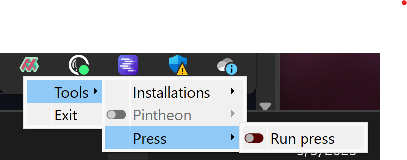
After installation, Press can be run by selecting 'Run Press', from the 'Press' sub-menu.
Your markdown folders & any associated media must be saved using specific folder structures. These structures define the separation of different sections in the web site.
Project Folder Setup
└── Project/
    ├── section_a/
    │   ├── page_a1.md
    │   └── page_a2.md
    ├── section_b/
    │   ├── page_b1.md
    │   ├── page_b2.md
    │   └── page_b3.md
    └── _resources/
        ├── logo.png
        └── banner.png
Inside of the main project folder, there should be a sub-folder for each set of markdown files for a given section.
└── Project/
    ├── home.md
    ├── section_a/
    │   ├── page_a1.md
    │   └── page_a2.md
    ├── section_b/
    │   ├── page_b1.md
    │   ├── page_b2.md
    │   └── page_b3.md
    └── _resources/
        ├── logo.png
        └── banner.png
Additionally, if a single markdown file is placed inside the project folder named 'home.md', this markdown file will be recognized and rendered differently as the homepage of the site, that can be configured to have links to specific sections of the site.
To understand the folder structure required for a project, download the sample project from the github repo, and open it with Press.
Select working project folder
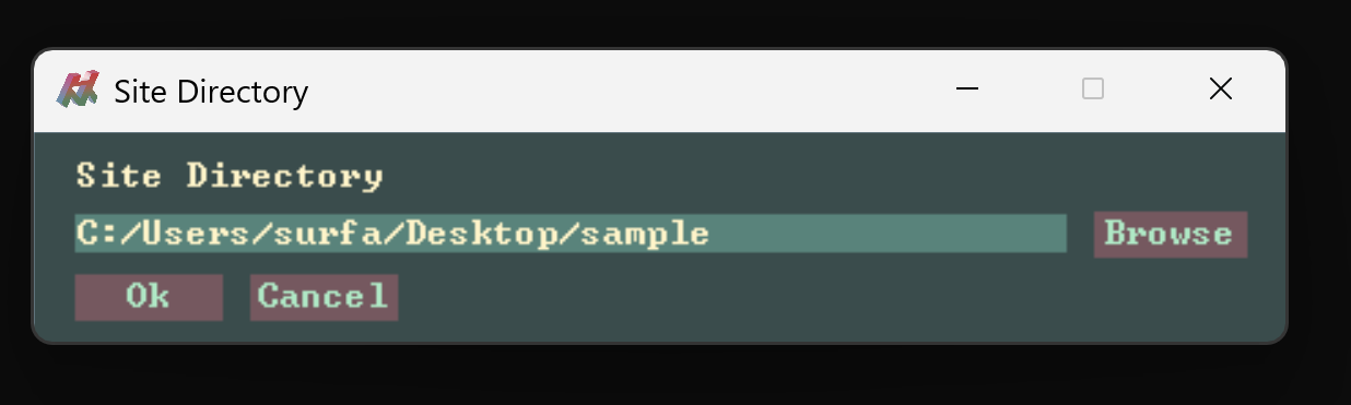
Download the sample project, run Press, and navigate into the 'sample' folder and click 'Ok'.
Launch Debug Site
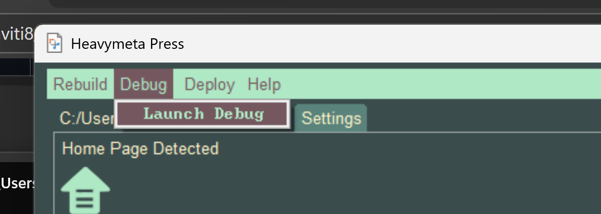
Choose Debug > Launch Debug, to render the markdown into a site on localhost.
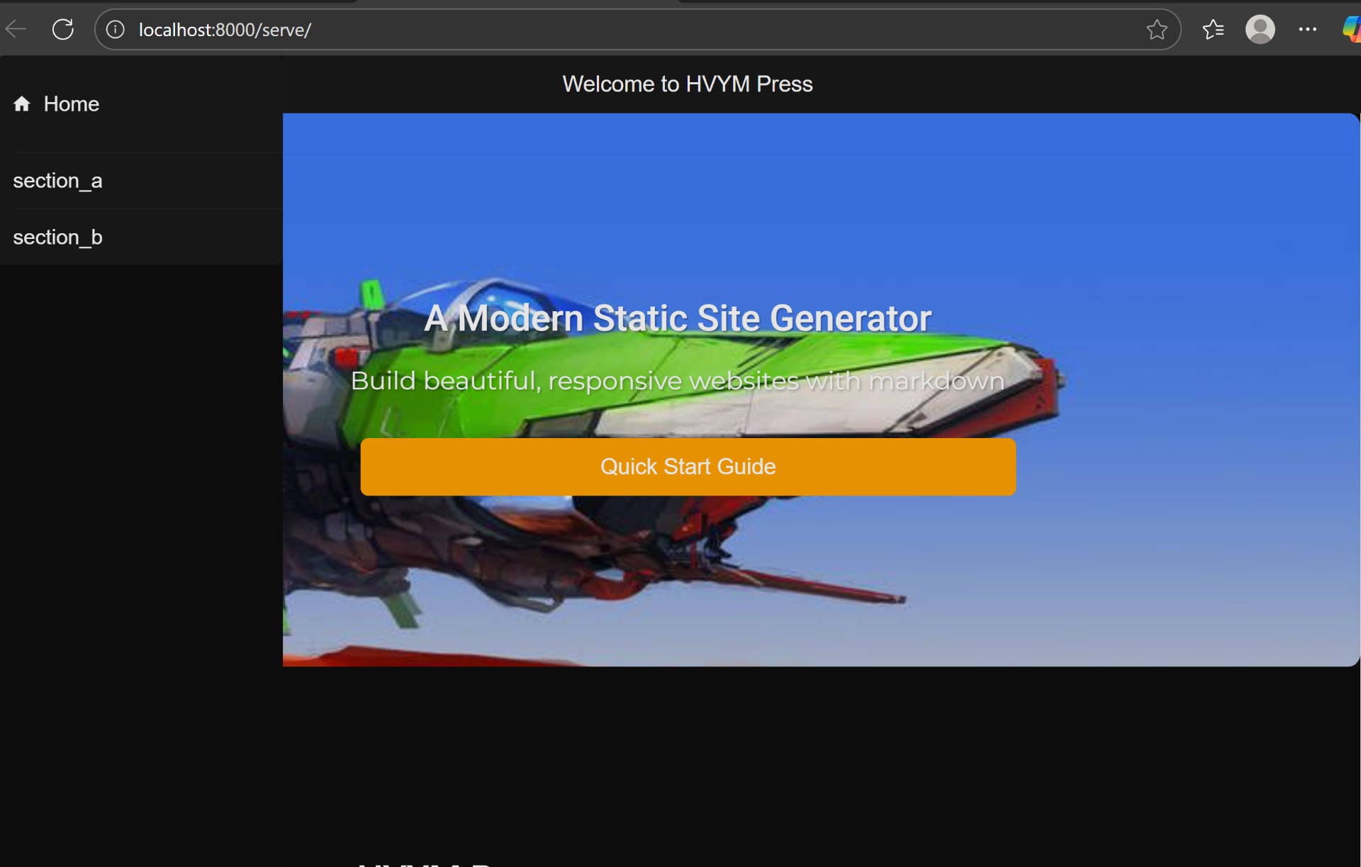
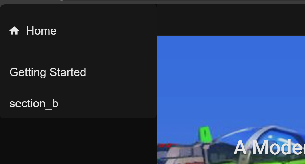
The site will be opened at http:localhost:8000/serve, and you can see how the site is rendered by default.
Press Main UI
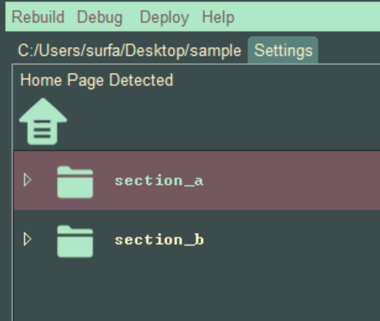
Folders, are shown in the Press ui, they represent "Pages" for the static app.
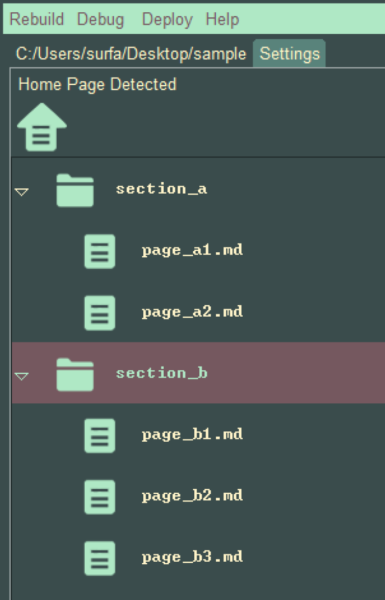
The folders("Pages"), can be expanded, showing the markdown files, they represent "Articles" for the static site.
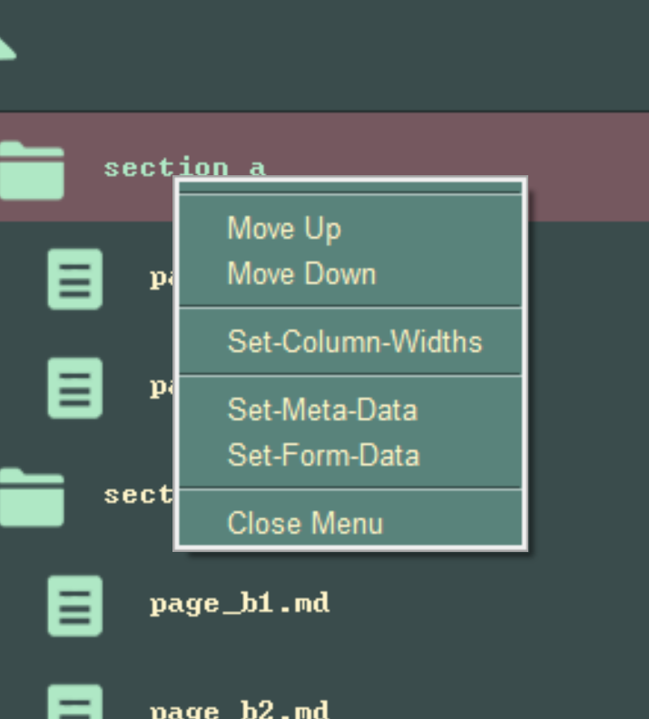
Both Pages and Articles can be re-ordered by right clicking them, and selecting 'Move Up' or 'Move Down'. In this way the Pages and Articles can be arranged into any order.
Customizing Site Elements
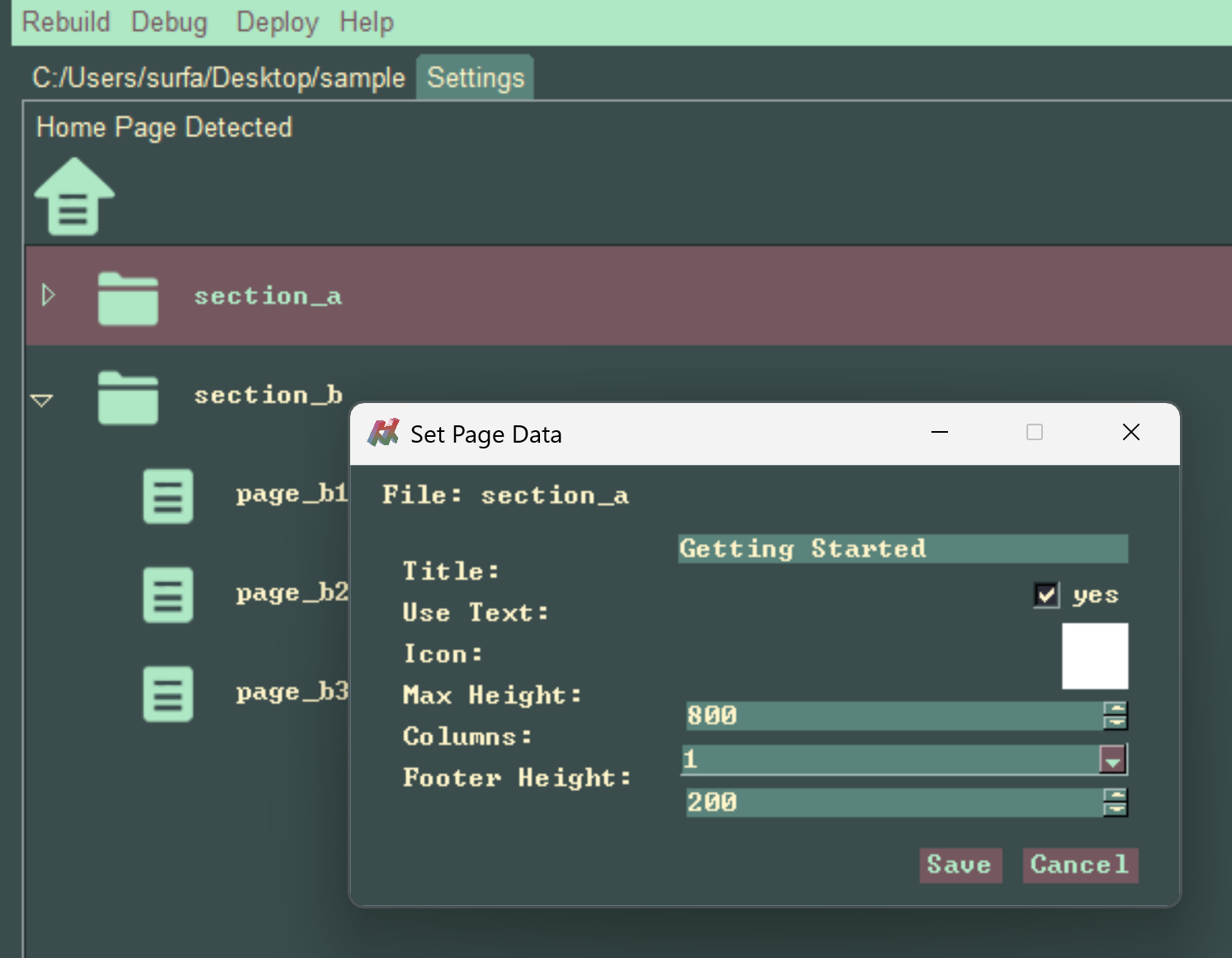
Each Page element can be double clicked, and the Page style can be customized.
Properties
Title
Used to set a custom title for the particular Page.Use Text
In the case, that an Icon is set, this ensures both the icon and text are rendered. If the icon is set, and Use Text is false, only the icon is rendered.Icon
The Page can use an Icon, when clicked a custom icon can be assigned.Max Height
This sets the Maximum Height of the rendered page.Columns
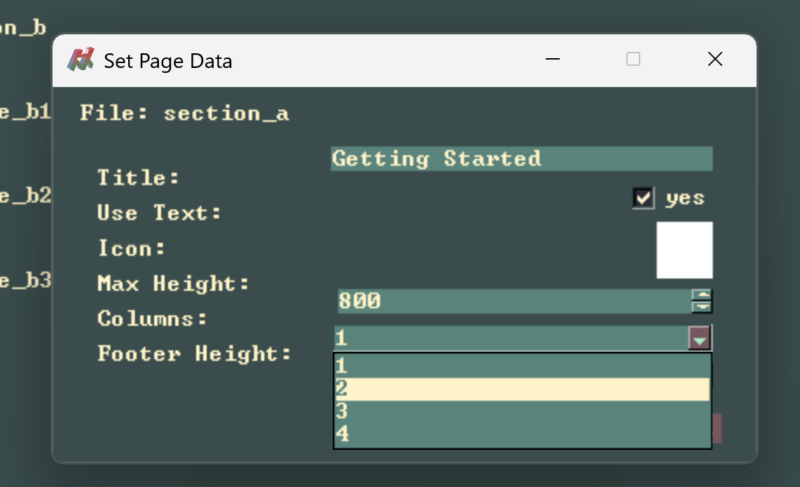
Articles on the Page by default are rendered in descending order in a single column, this drop-down can be used to set the number of columns for article placement.Footer Height
This sets space on the bottom of the Page, can be used to vertically place Articles, useful in particular in the case there a few Articles on a Page.
Customizing Article Titles
In this case, we can change the Page to use a custom Title, from being based on the original folder name 'section_a', to 'Getting Started'.
Customizing Article Style
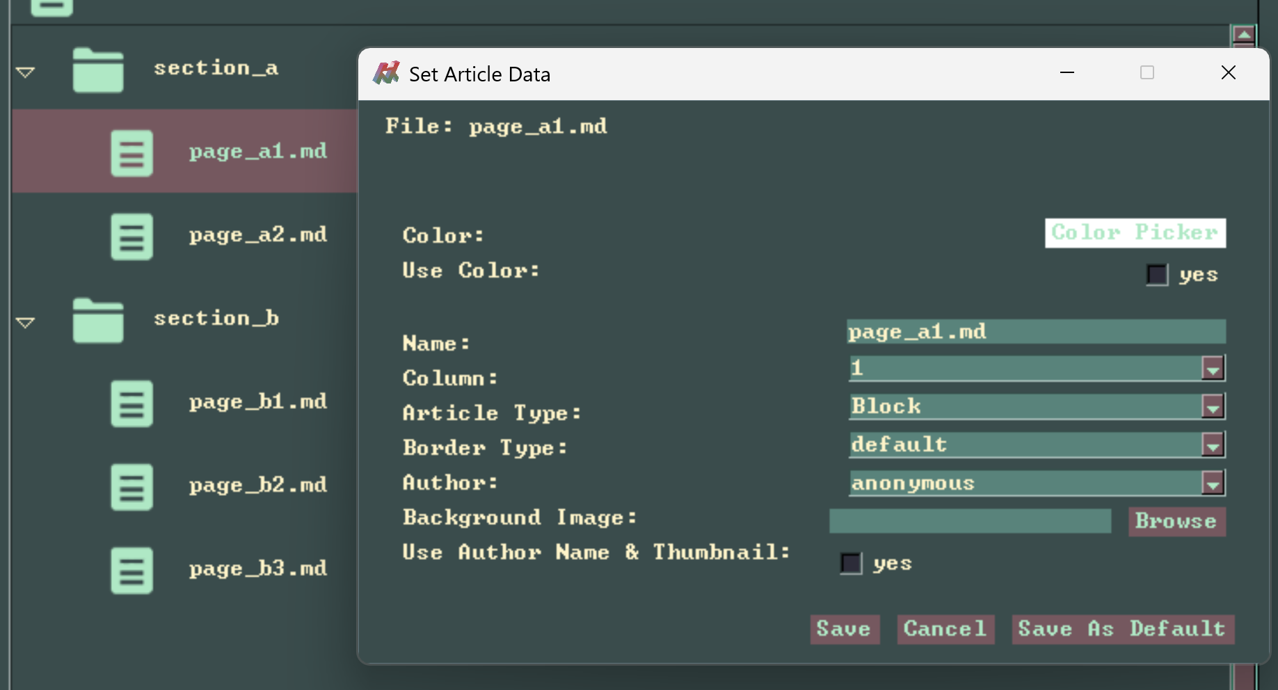
Each Article element can be double clicked, and the Article style can be customized.
Properties
Color
Used to set a custom color for the Article.Use Color
This is used in the case, the color has been set, but we want to not use it for this element. It's a bit of a janky control.Name
Set the custom name for tha Article, by default it uses the markdown file name.Border Type
Apply subtle style differences in the Article card element style.Author
This field will be populated with authors that are saved in the settings.Background Image
Set a custom image that is applied to the Article card, as well as the Article page background.Use Author Name & Thumbnail
This enables rendering of the author name and thumbnail, which is assigned in settings.Customization Example
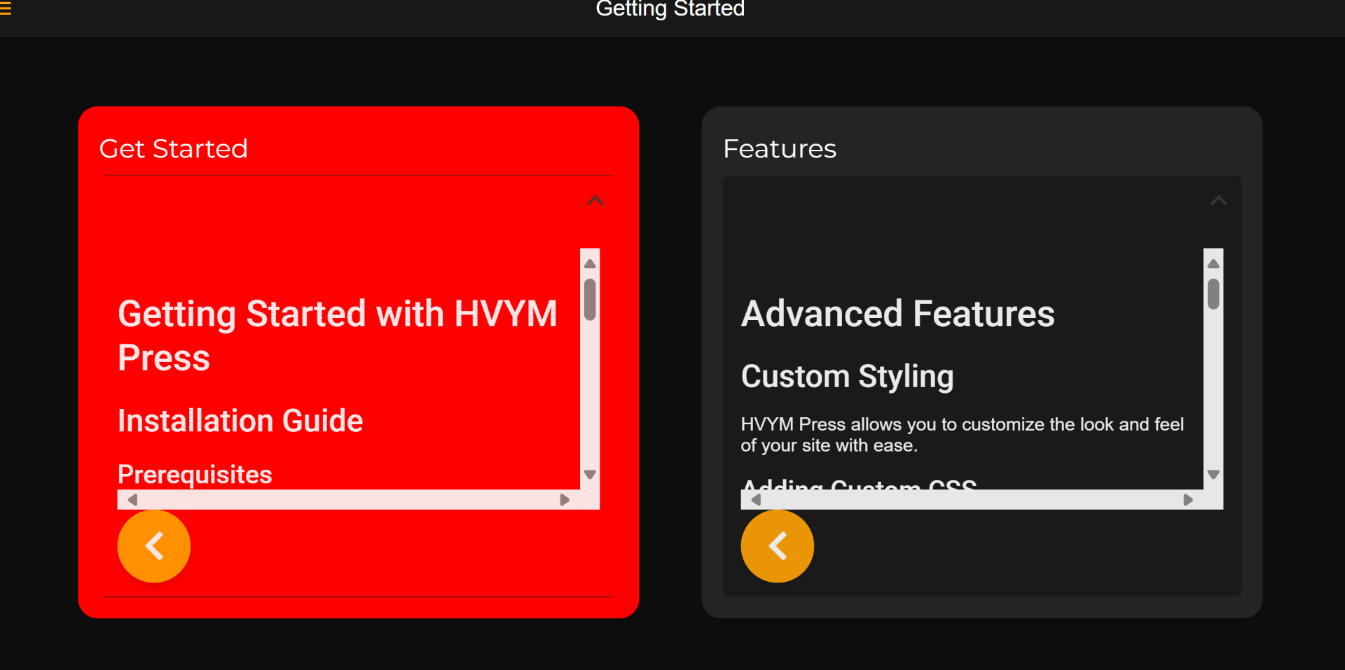
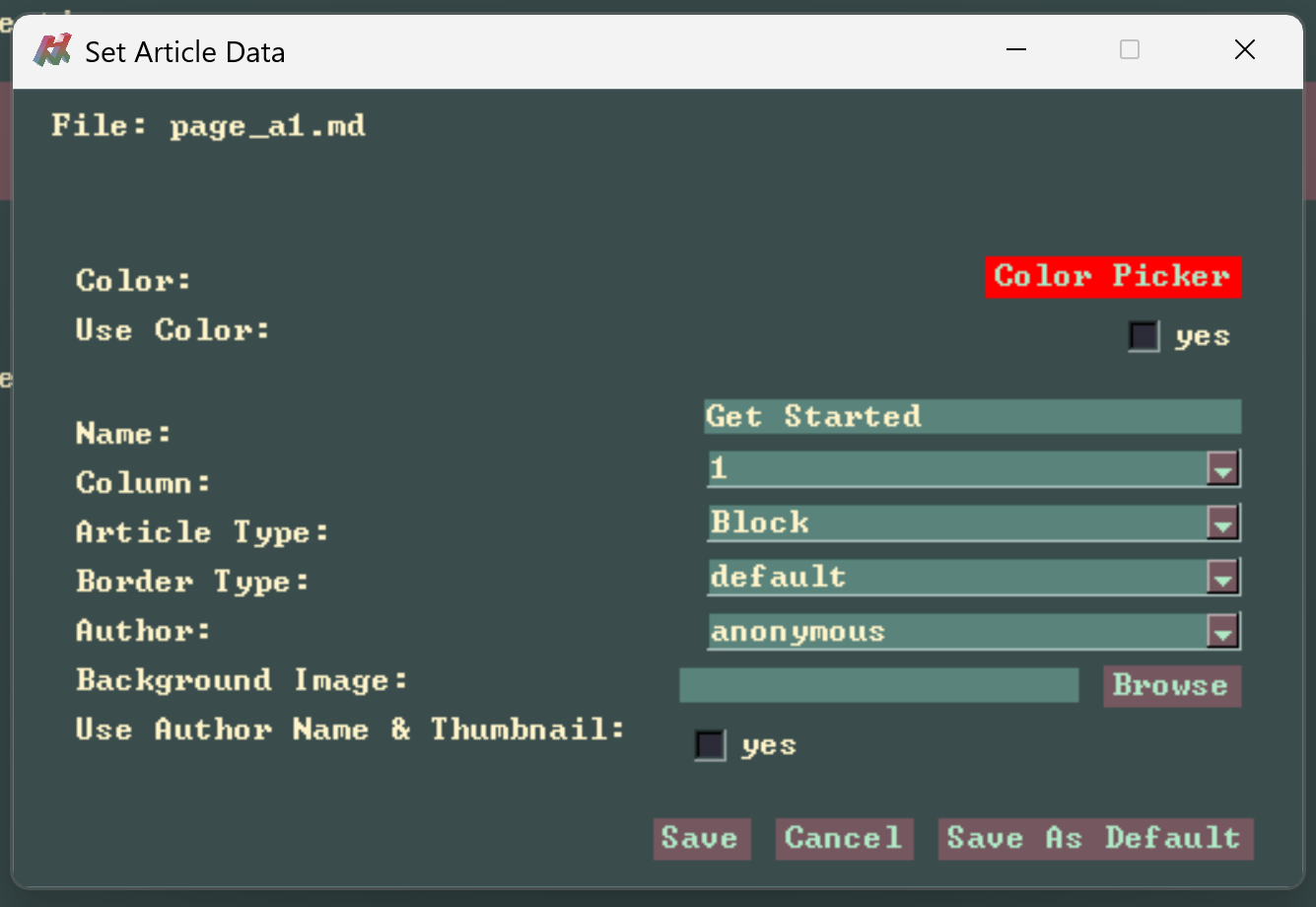
We earlier updated the page title to "Get Started", we can set the number of columns to 2 in the Page data.
We set the Color property to Red for page_a1.md.
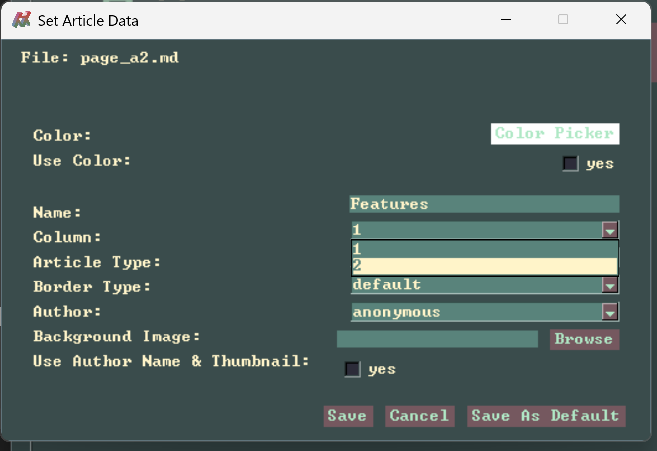
 Then for page_a2.md, we change the Column to 2, and set the Name to "Features".
Rebuild the site, and refresh the debug site, observe the changes.