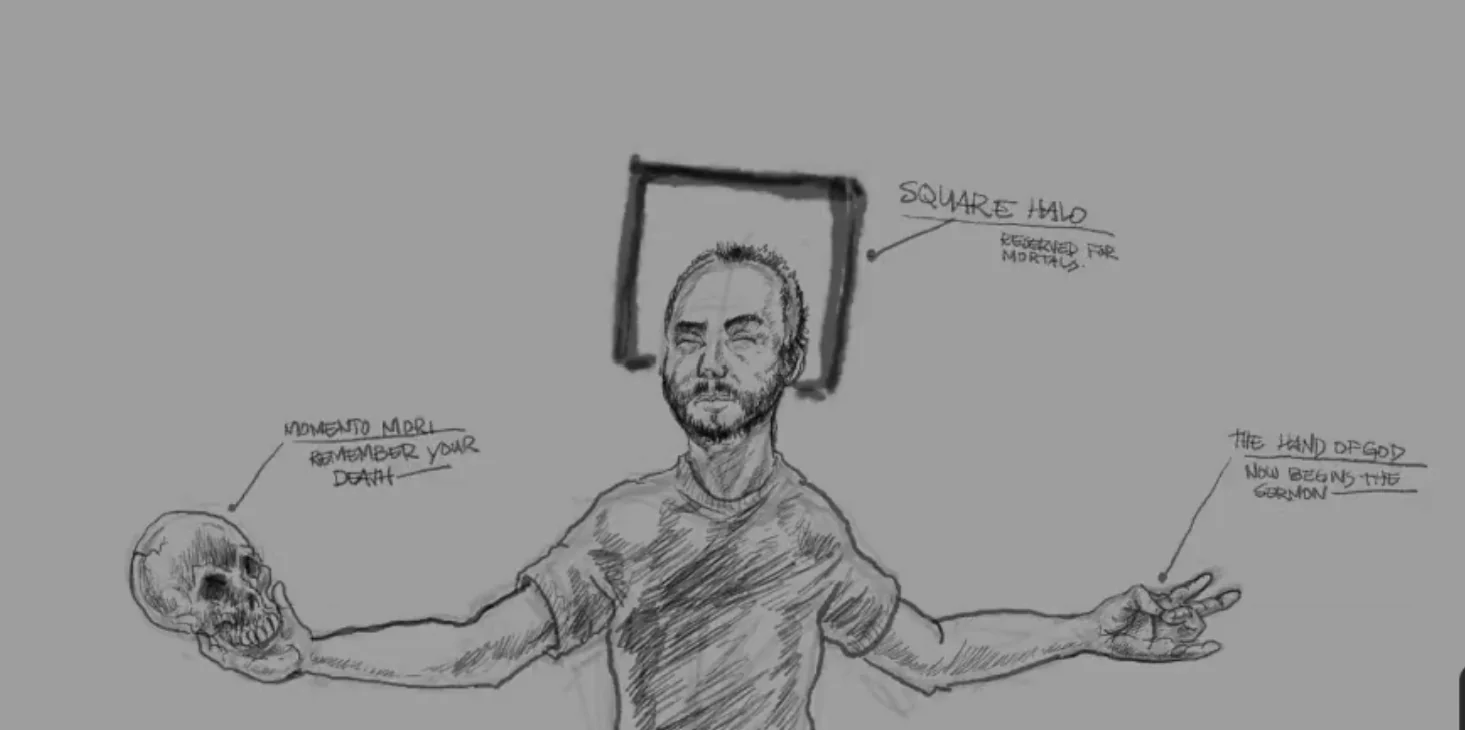
A Painted Language - Part 1
It's easy to look at examples of Christian Medieval Art and assume the artists were horribly unskilled. Generally it looks like they had a real problem with accurately rendering perspective in their art. The scale of the figures, for example may seem arbitrary. We are looking at the images through our own tinted glasses so to speak. We are so used to looking at perfectly rendered pictures, the majority of us take them at face value. I've seen the march of art toward hyper-realism achieved within my lifetime. When I was in school we were a long way off from escaping the uncanny valley... Now with AI people think we've achieved the pinnacle... Maybe in some ways, but beautiful imagery is only a singular aspect of visual art.
The Medieval artists commissioned to create paintings and frescoes were not going for realism at all. They were following a set of rules, that were meant to convey meaning or story directly. The majority of people of the time were illiterate. The artists were rendering with a visual language. I did this study to illustrate some of the rules they used. I am pretty loose in my own art, and I am showing you rules used across a variety of styles and periods in medieval Christian art.
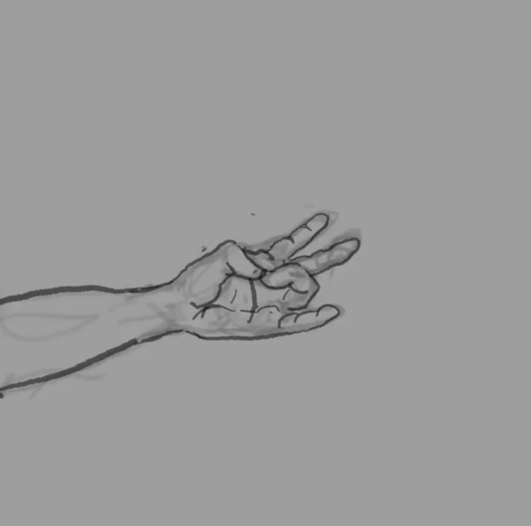
Hand Gesture:(Start of the Sermon):
I've chosen to draw my left hand with a gesture usually used for Christ, the ring finger touching the thumb with the other fingers extended outward, this symbolizes the start of the sermon. When making this gesture, Christ is usually holding a closed book. I wanted to draw a dichotomy between a Godly gesture, with what my right hand holds.
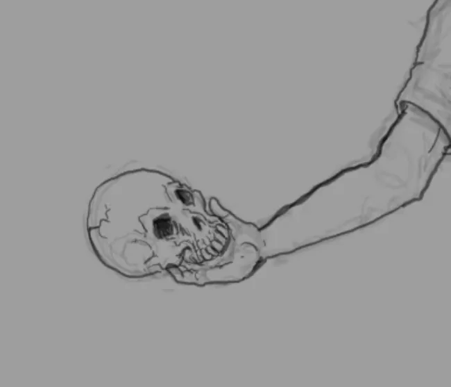
Memento Mori:(Latin: "Remember your death"):
It's pretty common to see a skull or a skeleton of some sort in the composition. This is meant to remind the viewer of their mortality in this world. This symbol is used even to this day in modern mediums of art. In my study, I decided to place a skull in my right hand.
Square Halo:
This rule is uncommon, and is sparsely seen in pieces from southern Italy since the 6th century. These were used to represent living donors to the art piece. We see this type of halo more often worn by particular popes or abbots who commissioned the art. It seems appropriate I wear the square halo in this study.
Hieratic Scale:
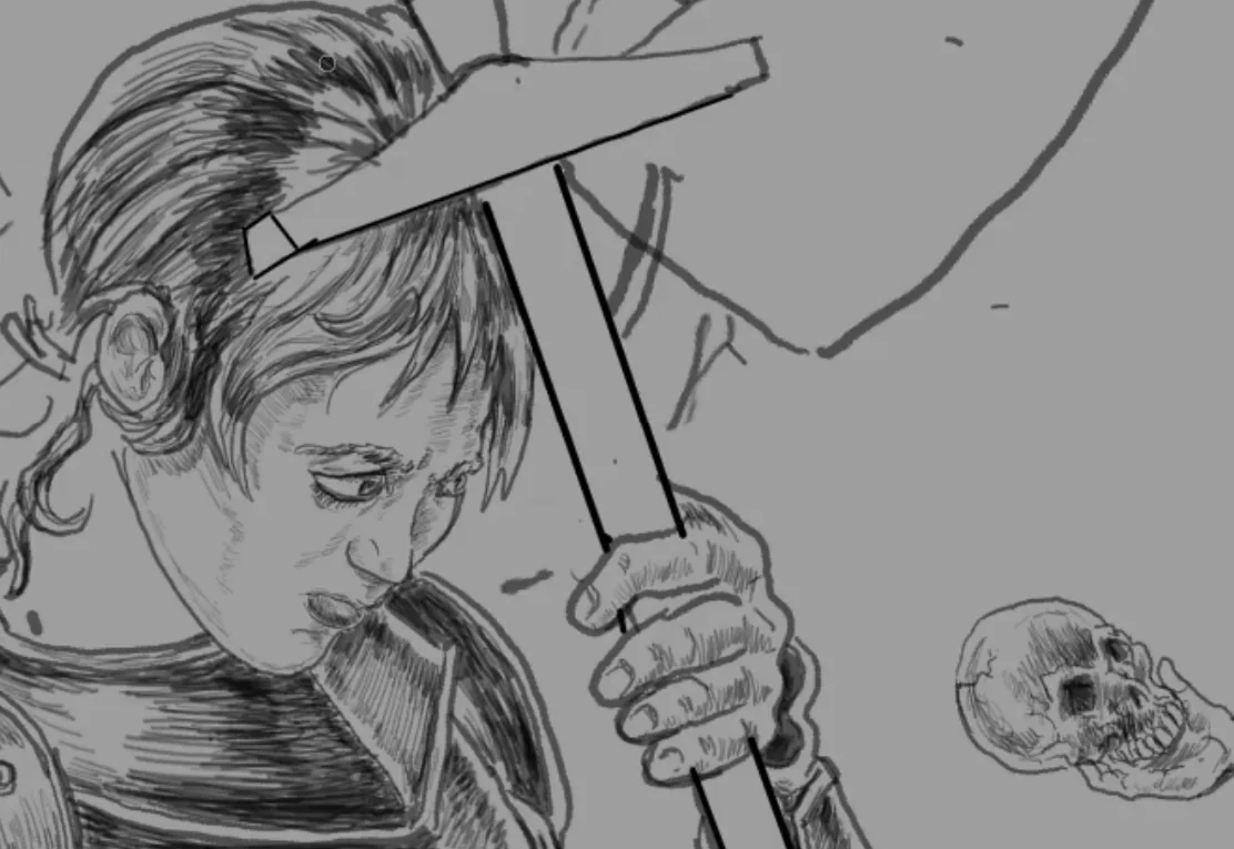
I've decided to add a Saint to this piece. Specifically one of the more popular and widely known Saints: Joan of Arc. You'll notice how large I am drawing her with relation to myself on the page. That's a rule called hieratic scale. Me being a mere mortal, I am rendered the smallest in the frame. Joan must be rendered significantly larger than me.
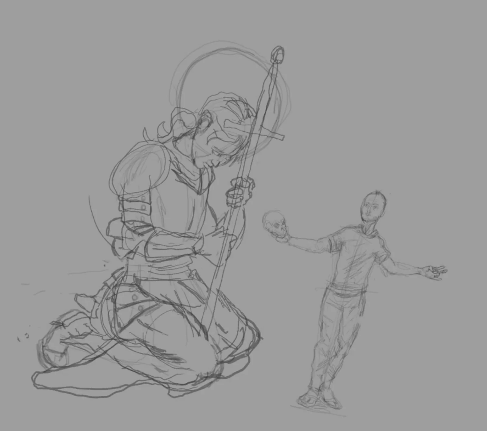
Round Halo:
I am giving Joan a Round Halo. The round halo is a signifier only reserved for Saints and Christ. It's rendered in a variety of ways classically. I've decided to render this one just as a ball of light.
Saintly Attribute:
A convention used in Christian Iconography specifically for the Saints, is that the well known ones have a specific attribute associated with them. You can think of it as a logo of sorts: an image or object, usually associated with their death... That helps to identify them. In Joan of Arc's case, it's her sword. Side note on saintly attributes, Joan of Arc was said to have heard the voices of 3 saints that preceded her. St. Michael, St. Margaret, and St. Catherine of Alexandria. I will add the attributes for each of these saints to the banner behind Joan's head, later down the line.

Gaze:
You may have already noticed that I rendered Joan's eyes gazing toward the memento mori in my hand. This is a common thing to do in medieval art. Many times actual lines were drawn from the subject's eyes to the object in the scene. In my case, no lines are needed. I want to convey in some way what she must have been feeling with the odds stacked against her, staring directly at her own death.